While recently researching the latest in web design for an upcoming project, we came across some surprising (and some not-so-surprising) trends and best practices for the new year and thought we’d share.
- Phase Out Sliders and Sidebars.
The slider (also known as a photo carousel) has been incredibly popular, but when looking for conversions and engaging your audience it’s best to steer clear. They are often a distraction that users skim right past. They don’t have the patience to wait for each message to appear, and even if they are interested, the message often automatically forwards to the next one before allowing the user to fully engage with the previous.
People think that if they cram as many messages as possible above the “fold”, they will maximize their impact. In reality, their message is diluted or ignored. Worse yet, people may click away from their site.
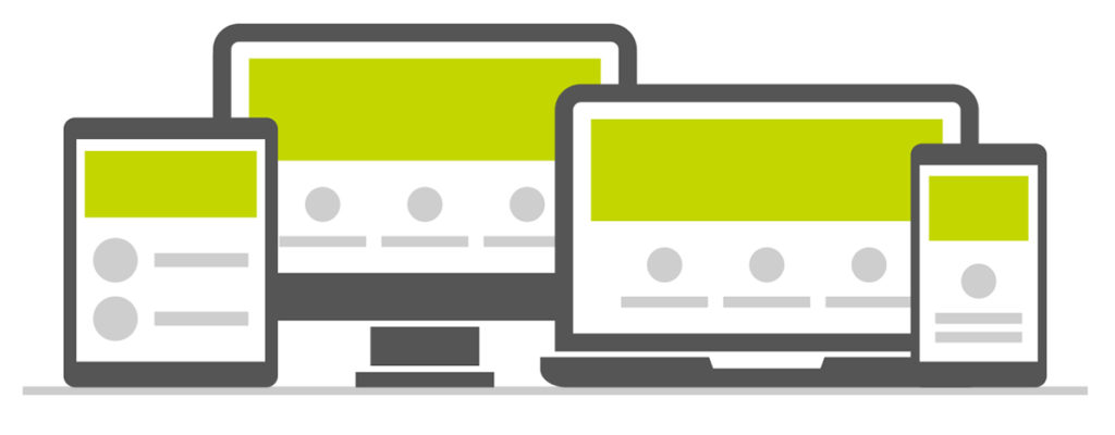
With mobile devices being the most widely used way users interact on the internet, a scrolling website is your best option. Users are accustomed to and actually expect to scroll through sites. Make the most impact by having a powerful image and succinct copy and a call to action as the first thing a user will see on your site. That will draw them in and encourage scrolling down to see more content.
Sidebars are similar to sliders – often ignored. You have extremely limited time to capture your audience’s attention, so don’t complicate it with more static like a sidebar.
That’s not to say there isn’t a place for sliders and sidebars. Sliders are a great way to showcase your portfolio – but they certainly aren’t for every site, and they definitely don’t belong at the top of your homepage.
- Larger Fonts and Better Imagery.
This may seem like a no-brainer – but bigger fonts lead to bigger impact, especially when people are using mobile devices more and more. Readability is crucial. Keep the content succinct and to the point. A call to action is another helpful way to draw readers in and lead to conversions.
Having authentic, original imagery that occupies a large amount of real estate on your site is a great way to capture and hold attention. You don’t need lots of images, just a few impactful ones. The human brain can process an image 60,000 times faster than text.* Having powerful imagery helps the viewer to understand much more quickly what you are trying to convey.
- Using Semi-Flat design vs. Flat design
Flat design is a style that has no glossy or three-dimensional visual effects. It became popular with the release of Microsoft’s Metro design language and Windows 8 in 2011, along with Apple’s homepage in 2013.** It focuses on minimalism in terms of design.
It used to be apparent to click when something was either blue, underlined, or had 3-D effects. With flat design, it became more difficult to detect linked elements. Therefore Semi-Flat design has evolved to correct these issues. It adds subtle depth and dimension with shadows and shading, which has helped to mitigate the issues of flat design.
While still maintaining the sharp and sophisticated look of a Flat design, Semi-Flat design can improve usability on your site, which in turn can lead to the all important conversion.
- Video is on the Rise.
While video has long been around, it is becoming more and more powerful as a tool for storytelling and marketing. It is compelling, instantly engaging and quickly draws in its audience. Including video on a landing page can increase conversion by 80%. *** And by 2020, video will be 82 percent of all consumer Internet traffic.****
Video needs to load and play quickly, because impact is lost if a viewer is waiting for it to load. All you need to create compelling video content is a smartphone so get started today!
- Simplify Your Navigation.
Complicated navigation systems create way too many options for people and can actually drive them away. Having clear, concise labels that allow readers to know what is in each category provides better usability. For example, don’t use adjectives, instead pick short, predictable words. The easier it is for a reader to navigate your site, the more likely they are to stay and click around.
These are just a few of the many trends happening in web design, but we think they’re some of the most important. They’ll help get you going in the right direction with staying on top of the latest strategies in excellent web design and presence.
Sources:
** https://www.nngroup.com/articles/flat-design/
*** https://blog.hubspot.com/marketing/video-marketing-statistics#sm.000005pswuag36cweqpnrdp1zt26s
 Erin Rogers, Creative Director at Jet Marketing
Erin enjoys a good, local coffee shop and family road trips.