Jet Marketing

My colleague Lindsey, who hails from the Midwest, not too far from where I currently live, recently shared a Facebook Reel with me, anticipating my amusement. What was funny was I’d already seen it, and had immediately thought of her as well. If you haven’t checked out Charlie Berens’ Midwest Billboard video, it’s worth a watch, even if not from the Midwest. We’ve conveniently shared it here on this page. What adds to his humorous take on billboard design is just how regionally specific it is.
You don’t often think of billboard design as award-winning work necessarily, but there is an art to it. As a designer, I think Berens nailed some very important rules when it comes to creating a billboard.
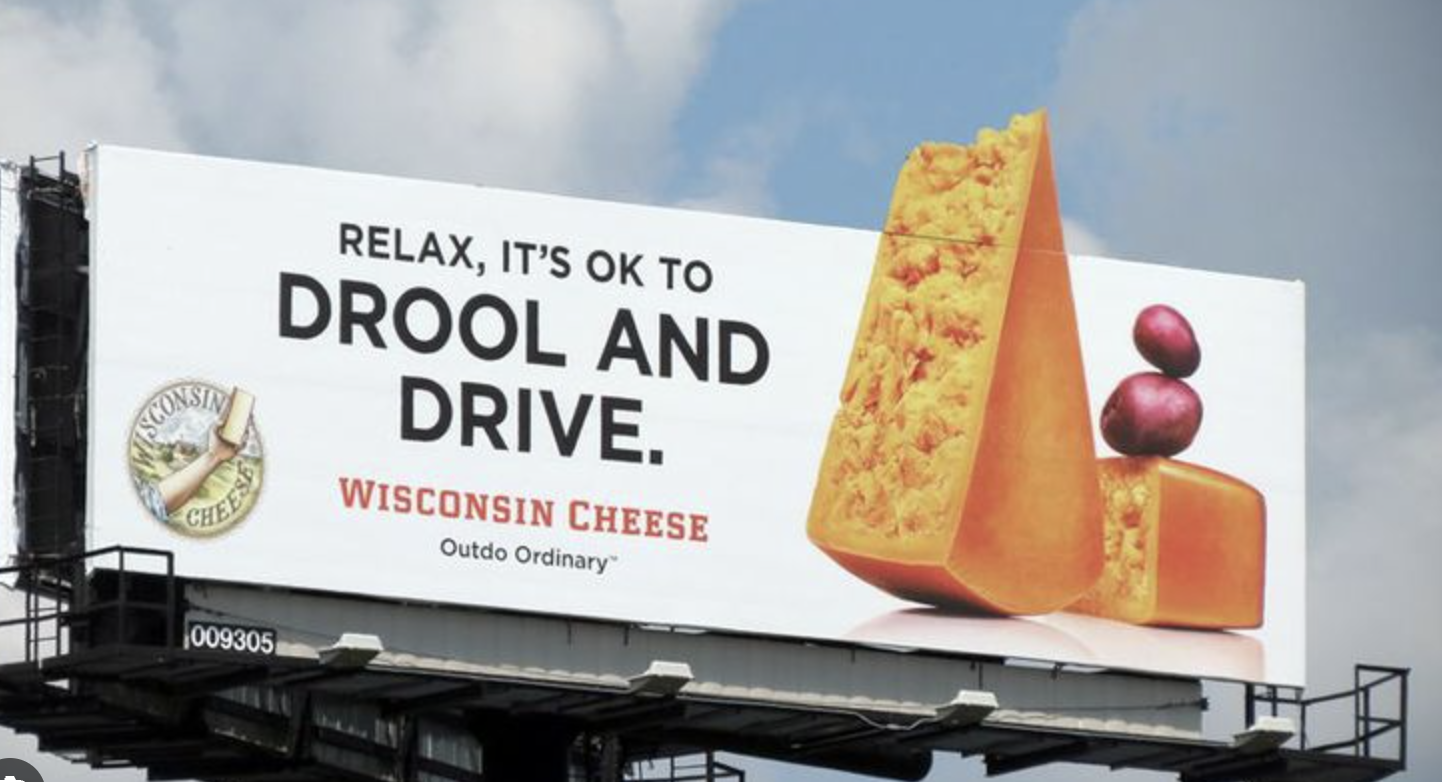
1. Brevity is Key: Billboard advertising has to tell a story about your company using thought-provoking imagery and few words. FEW WORDS. The key here is brevity; the audience must grasp your message in three seconds or less.
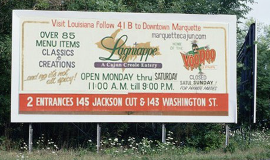
Too much clutter and text.
2. Contrast Matters: Next, the focus should be on contrasting colors. Keep the colors bright and defined so they don’t blend in with the environment around the billboard. Digital billboards, with their RGB mode, offer a broader spectrum of brighter colors, making them a good option.
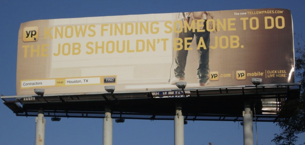
Not enough contrast.
3. Simplify the Call to Action: Keep the focus on just one call to action—which should be short and sweet. While including a website domain is not typically recommended, if you do, omit “www.” Phone numbers are also discouraged, as it’s unlikely that viewers will remember them while driving. Unless, of course, you have a memorable vanity number, like 1-800-Flowers.
4. Font Selection: Font choice and weight are crucial – avoid using thin or light fonts. In certain cases, such as with one of Jet’s healthcare clients, we even enhance the logo font. This is the only scenario where we permit alterations to their logo. Their logo font tends to be on the thinner side, so we offer a bolder option specifically for billboard usage.
If your billboard has a catchy headline, a clear call-to-action, and prominently features your company’s name, you’re all set. Resources like Google have simplified the process of getting more information about a business. So next time you’re on a road trip, and the billboards start popping up, see if you can spot the ones that have made good use of these rules. But remember, safety first—keep your eyes on the road!
 Erin Rogers, Creative Director at Jet Marketing
Erin brings her trademark creativity to every facet of her life – from work and parenting, to family playtime. She finds breakfast time with the kids (and a big cup of coffee) to be the best time to connect and get the creative juices flowing.